Wednesday 24 February 2016

Is drawing a language? Part 3

The idea that we can talk about a visual language, it could be argued is flawed. In particular recent neurological research suggests that language or the ability to construct languages is very specific and works outside of several areas of mental experience.  In cases of synesthesia, the complex interrelationship between different sense organs and the brain can lead to strange situations such as being able to taste shapes. However research into this area has also pointed to the fact that language construction is not the same as understanding. You can lose the ability to construct language and yet still be able to experience and communicate experiences. Kandinsky, one of the founders of the Bauhaus and close associate of Paul Klee, was known to have synesthesia; his presumption that we could build a visual language that would work in the same way for all people, has been often taken for granted. In particular his influence on the Bauhaus basic design course, and following that, the Bauhaus model being introduced to British art schools via pre-diploma and foundation courses in art and design, has meant that the idea of a basic visual language has been commonly accepted throughout the art education establishment. More recent research has however questioned this, and it has been suggested that Kandinsky's forms and their associated meanings are things that can be learnt in a similar way to road signs. 

In Richard Cytowic's 'The Man Who Tasted Shapes' it is pointed out that no two synesthetics 'see' their associations the same way, one person hearing the sound of a trumpet as bright red, another as cold blue. These issues point to a much more complex problem and one fundamental to my question. Are languages learnt or innate? We can all agree that a banana is yellow, but have we come to that agreement because we have learnt this, or because we have perceived this? Colour theory points to the fact that colour is dependant on the light source. During the day the predominant colour of daylight can shift, things should appear bluer in the morning and redder towards twilight, but whenever we look we still see a white piece of paper as white, we don't notice that appearances remain constant under widely different conditions, because it is useful for us to believe that the same essential thing still holds 'true' form or shape. If every time we saw something it changed, we would spend too much energy trying to decide whether or not it had now become a threat. Scientists have named this psychophysical issue 'colour constancy'. We in effect attribute a constant colour to things seen, 'one different from what it 'really' is'. (Cytowic, 2003, p.62) Cytowic goes on to state; 'The flux of energy reaching our retinas changes constantly. The same is true for the flux reaching our other sense organs. Since our sense organs are energy transducers, our perception of what things "really" are should change accordingly. Instead we are confounded by an illusion of constancy where non "really" exists'. Therefore the question about visual language should perhaps be rephrased as, 'How do any of us agree on anything?' 

I found this interesting diagram of synesthesia. It points to a complex interdependence of sensory information and to the development of meaning through association. 


What is important to us is partly learnt and partly innate. We feel hunger, but cultural coding will depend on how we satisfy it. In India it is unlikely that you will be able to eat a cow to satisfy your hunger, but in Argentina it is hard to be a vegetarian. However it is of course possible that someone could eat beef in India and a salad in Argentina, but in each case they would be seen to be 'transgressive' of what is regarded as a 'norm'. I would suggest that 'visual language' is similar to this. We learn British road signs and associated conventions because these are essential to our well being. If we step off the pavement and look the wrong way for traffic we could be killed. However we have to re-learn traffic direction conventions if we travel outside of the British road sign 'language' limits. You could therefore regard art college training as simply learning to read the 'art' road signs. The problem being that no one has a definitive highway code. 

The issue of language 'rules' is perhaps like so many things eventually a political one. Who gets to determine the rules of language and how? When the Normans invaded and conquered England they imposed French as the language of discourse, only 'common' people spoke 'English', or what was then seen as 'English'. Gradually of course the courtly French language would merge with old English, to form the language we now use. However the 'English' we use is constantly changing and certain constraints are put in place to ensure it doesn't change too quickly, for instance the Oxford English Dictionary will only allow a new word to be recorded in the dictionary after serious research that has established a new word's common awareness amongst a wide range of people and a proven use value. (I.e. the new word is needed, because it allows things to be said, and of course therefore thought, that older combinations of words are unable to articulate correctly.) So languages do change, but they keep their shape by regulation and the regulators are by definition powerful. 
Young children need to be brought into the social matrix by education into basic rules of behaviour, and one key aspect of this is learning the language of the 'tribe', in our case 'English'. However verbal language is only one aspect of this learning, another is the constancy of identification in relation to formal change. By feeling an object at the same time that it is looked at, a child can determine that although it looks very different from different angles, it still has one identity. This is reinforced by social behaviour, others pointing to said object and giving it a name, and doing this over and over again, until several 'associations' are made and it is these inter-related associations that begin to ground meaning. This process is very sophisticated and will eventually allow us to be able to read both red and green apples as 'apples'. We learn to decide whether form is more important than surface colour, or weight more important than texture, constantly testing out the world in association with the 'rules' we are taught. 
If I take this analogy back into art education you can clearly see how at interview to a BA program some students are taught how to shape their practice to fulfil the language of 'A' level art and others the language of their foundation course, we of course as a degree programme are continuing the practice, but it can be hard to see the rules when you are a fish swimming in the waters of the institution. 
It is however no different outside of the education world. The 'art world' itself has languages of discourse and you have to become an insider to learn these rules. 

Therefore you could argue that this blog is itself a means to introduce you to the 'rules of the game'. 

For instance the blog covers several overlapping areas of accepted 'language' use. 
It establishes old patterns of language, such as the fact that there is a 'specificity' to the way each material can be handled, so posts looking at 'graphite' or 'ballpoint' it could be argued reinforce ideas initially brought into aesthetics by Lessing and then elaborated by Greenberg. Posts on more performative aspects of drawing point to an expanded practice of drawing (and art) and the fact that performative theory is now one of the key areas of art's theoretical investigation, as it allows us to see 'art' in relation to all areas of human activity, and the processes of human interaction, rather than just in relation to the symbolic meaning of static objects. 

By moving from subject to subject, and yet at the same time each post being about 'drawing'  this blog provides a similar learning curve to the one you go through when trying to work out whether the changing forms of an object are all part of one thing or whether new things are forming. As Father Ted argued, a cow is still a cow, even if it is tiny and in the distance. It is experience and association that will allow us to eventually realise that as one aspect of use is mastered, we may well have to reconcile this with new uses. We can still appreciate a drawing that explores material properties or provides us with a visual narrative, whilst also being able to appreciate a drawing that is performed or is about process rather than being an object for contemplation. 

The complexity of the situation is actually what makes it exciting. 

The artist James Merry has synesthesia. This is what he has to say about his recent embroidery work, “I think a lot of it was an attempt to explain actual physical sensations I would feel when looking at plants or flowers—some kind of weird tactile/plant synesthesia. My fingers would tingle when I'd see small furry buds on the end of branches, or I'd feel flowers growing out of my eyes if I stared at them too long. I was fascinated by that overlap between botanical and anatomical. It's always such a lush place, where two seemingly different worlds can overlap”.
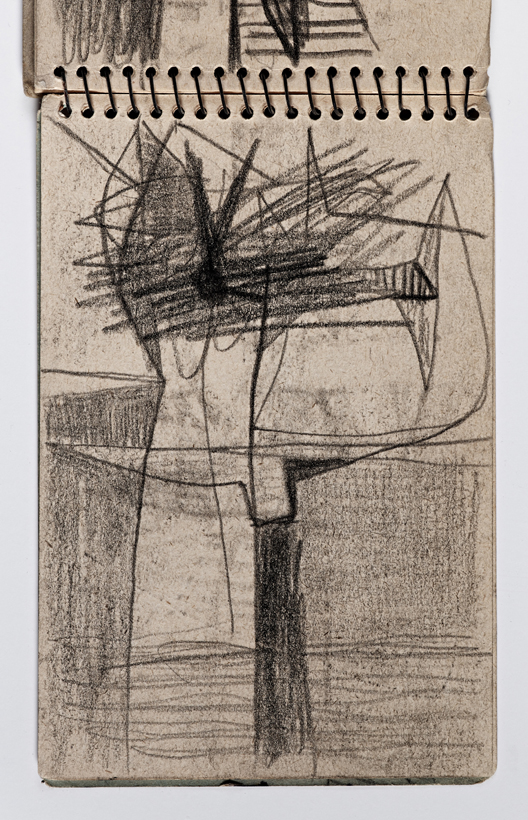
This drawing (below) by James Merry was an attempt by him to illustrate how he has an awareness of his own particular synaesthesia. The drawing tries to show how his own awareness of his 'optic nerves' can be as much about the physical presence of these things in his head, as an 'outside' view. 

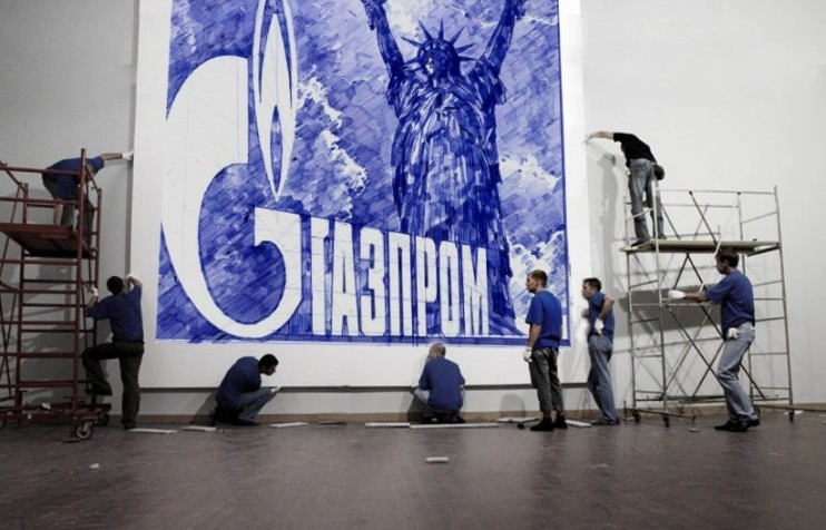
Merry is a long time collaborator with the musician Bjork, another artist who is concerned to break down the barriers between art forms and to 'realise' the power of music to effect our emotional/physical experience. She believes that her ideas can be further developed when coupled with other art forms and by working with other artists. What I was particularly interested in was that Merry's synaesthesia allowed him to 'read' what we would simply see as a language of the logo, as something much more sensual. For an artist all things are potential fertile ground for the growth of creative ideas. 


See also:


Sunday 21 February 2016

The Ballpoint Pen

Joan Salo: Drawing on canvas using coloured ballpoint pens

It's been a while since I put up a post about a particular drawing material and one of the most common, one which is used by many of us on a daily basis as a go to implement; is the biro or ballpoint pen. This is a type of pen that as a young artist I was warned off using,  I was told it had no expressive power because its line was not variable. However; as you become more familiar with it, you realise it has its own unique set of attributes and these can be pushed to their limits.

Like most materials used within art practice it can be examined in two ways. First of all as a material with particular qualities, qualities that can be investigated within a non figurative framework, and the structuring of the investigation can be very process led.  In the case of Ill Lee's work (below), there is a very simple core idea, however because the drawings are worked on for hours at a time, eventually the energy masses created vibrate with a refined almost 'dancing' energy. This has a lot to do with the speed with which the lines are created.  Each individual line has a smooth curvature, one that reflects that these lines are made quickly with purpose and an authority. This is not a shaky, fragile line, and because of this the images vibrate with a confident energy. The three dark shapes in the drawing below are composed of thousands of lines worked one on top of each other, a process that suggests that the images gradually arriving are a result of energy turning into mass.  


Ill Lee

Compare Ill Lee's work with Joan Salo's. 

Joan Salo

Salo's work uses a ballpoint pen together with a ruler to develop systematic explorations of vertical lines. The darker elements being where lines overlap in their making. 

The other way to look at the use of ballpoint pens is to examine their expressive qualities, and to explore what happens when familiar visual imagery is rendered by them. In the rendering of forms, all materials have what you could call expressive specificity.  The soft broken lines of charcoal being totally different to the sharp precision of the ballpoint line. The fact that ballpoints come ready loaded with coloured ink means that a particular colour range not only becomes available, most often blues, blacks, greens and reds, but that these colours become one of the defining properties of biro drawing. 


Of course the key expressive factor is the fact that biros produce continuous flowing lines; you don't have to keep refreshing the ink by dipping this drawing implement into a reservoir, the tip being composed of a smoothly rolling ball, which can travel in any direction, thus eliminating the dip-in pen stroke's thickness difference. The fact that the line is very thin and sharp edged, coupled with the fact that the ink dries almost as soon as it is applied to the paper surface, means that you can make very detailed drawings that can reach a high level of 'finish'. 

Gary Lawrence: Homage To Anonymous: Ballpoint pen (6ft by 4ft)

The drawing above by Gary Lawrence won the Jerwood Drawing competition a few years ago, only a ballpoint pen could have given the artist the facility to render such an amount of crisp detail over such a large surface area.  Compare his work with that of Renato Orara, who makes highly detailed drawings of individual objects that float isolated in white space. 

Renato Orara

Andrei Molodkin began using ballpoint pens to draw when he was in the Russian army; soldiers were issued two ballpoint pens, so that they could write letters home to their loved ones. He now works with ballpoints on a huge scale and often draws directly onto canvas. 


Andrei Molodkin

Although beginning to use ballpoints when in the army, Molodkin associates the use of ballpoints with prison, as no other writing implements are allowed. 

Jacques Floret states that "the four colour ballpoint pen has for a number of years, been my tool of choice. I use the four colour ballpoint pen so that I don't have to choose my colours." His image of what I take to be an elastic band powered motorboat that someone has made out of the odds and sods of an old matchbox, a few matches and a twisted elastic band, makes me think about what it means to be inventive. Invention is often about encounters. In this case an encounter with an old cork, the box of matches, and a rubber band, meets a man with four biros. Yet another material idea emerges. Humans pride themselves on their ability to be inventive, and yet Floret reveals a paradox, he uses the same four biros over and over again because that means he doesn't have to choose his colours, which perhaps reflects the fact that human choice to do things isn't all what it's cracked up to be, and that the little boat is as much about the matches, matchbox, elastic and cork as it is about a human being or a biro. The important issue is that as they encounter each other, something else emerges, something that is a product of all of them, not just the animal that prides itself on its ability to think. 

Jacques Floret

Donna Coleman is a Leeds based artist that often uses ballpoint pens. Working in that gap between figuration and abstraction, her disembodied heads float in a haze of biro lines. A cloud of vibrating lines will come slowly into focus as a human and then as you stare at it, it may dissolve back into a swirl of marks. Sometimes she will leave gaps, returning attention back to the paper surface revealing all as an illusion. Donna's heads sit in that space of uncertainty that perhaps so many of us live in, reminding us that all is illusion and that all we really consist of is a vibratory pattern, sometimes perceived by others and at other times invisible to all. 

Donna Coleman: Social Media Immersion

Donna Coleman: Apathy

Part of a material's communication range is associated with its history and common uses. The 'biro' is the world's most used writing implement, and was as most people know invented by László Bíró. Its cheapness and ready availability mark it out as a medium for 'everyone', therefore it is a good material to use, especially if you want to avoid the 'art' associations of certain materials such as charcoal or graphite. The tool of a billion doodles, the biro has a rich sub-text and as a material it is well worthwhile investigating. In particular if you go back to Biró's initial research, the idea of working with very stiff ink and a metal rolling ball is fascinating, and could be opened out into performance, sculpture and installation work, as well as of course new drawings. 

Some artists using ballpoint pens sit in that gap between fine art and commercial art. For instance, the use of a biro to make his work allows Lennie Mace to move between tattoo design, cartoons and surrealist inspired imagery, without a worry over what particular area he should be operating out of. He just does what he does. 


Lenny Mace

There is a book now available that showcases some of the best work of this sort: The Art of the Ballpoint by Matt Rota.


Coda

Several years after putting up this post I was asked to work with Donna Colemen on a small book about her work. This artists' book is still available here.

Wednesday 17 February 2016

Richard Diebenkorn: The Sketchbooks


Richard Diebenkorn's sketchbooks have been made available freely on line. Go to http://museum.stanford.edu/diebenkornsketchbooks/


If you are interested in that gap between abstraction and figuration, Diebenkorn's work should be of interest and sketchbooks are always fascinating as they give you a privileged insight into the way an artist thinks. 

See also:


Tuesday 16 February 2016

Frances Richardson: Drawing as thin sculpture


The artist's talks yesterday were very interesting. In particular Frances Richardson made some interesting comments about her work as a sculptor who has found a drawing language  that is at times clearer than her sculptural language. 
Her concept of drawing as thin sculpture and her association of 'graphine' with graphite, were indicative of the way a sculptor could come to drawing as a way of thinking about materials. 
If you go to her web-site the fact that she entitles the section where you will find her drawings 'works on paper' is indicative of how she thinks. These are drawings about paper's material properties, and could just as easily be called 'works using paper'. If you go to her web-site to look at the drawings, you will be able to see how important the physicality of the paper is to her. The mould-made paper she uses has an 'organic' or 'deckle' edge  and makes each sheet of paper more object-like.   See also post of 8th Nov 2014 on paper edges.
She uses the graphite's ability to respond to touch very sensitively, the fact that you get a tonal change as you increase pressure on the pencil or graphite stick is an obvious physical attribute of this process, but to control this over a large surface area and with so many marks takes a long time of concentrated effort. As Frances Richardson pointed out, just one mark made with the wrong pressure and the whole effect is destroyed, because that one mark will pop out of the spatial co-ordination and harmonisation that has been developed. Some drawings work from very delicate marks in their centre which get darker as they approach the edge and others begin with darker marks on an edge and as they work their way down the drawing, the marks fade out. The marks themselves are composed using the signs + and – . As marks they are manifest in various densities of graphite. Richardson has previously stated that they are a “ a conceptual preposition, the presentation of the moment of being in space and time: a pulse that tends towards nothing and everything”. She also describes the work as a gestural act: “drawing is a point of touch, an action that marks the intangible physical reality of being in a moment and a suspension and presentation of this moment to the viewer.” The idea that the drawings are about gesture and touch, reminding us of the physicality of making, which reinforces the fact that all human made objects are in some ways frozen memories of their construction. I was also interested in Richardson's titles for the drawings. I didn't get a chance to ask her but I presume that titles like ''290208' refer to the number of marks needed to make the drawing. If I'm right, this further enhances the awareness of how time is invested in their making and the concept of objects being frozen memories of their making. 
These are very simple and direct decisions about material properties and material placement, again reflecting Richardson's sculptural interests. 


You could think of the broken edges of the drawing above as if Richardson is thinking of a shape being 'carved' away, her earlier apprenticeship as a carver in Nigeria, still affecting her decision making, even if now quite sub-consciously.

The process of drawing and how drawing can be thought of has paradoxically begun to shape the way she begins to think about sculpture; describing her more recent sculptural work as "drawings for sculpture". The fact that in these works MDF is shaped to resemble bent metal I beams, reflecting the fact that drawing is traditionally used to represent how a material object might look, the drawing 'standing for' an object. It was interesting to hear that Richardson also works for an architectural practice, so must see a lot of drawings meant as visualisations of what would eventually be solid buildings. 

 Richardson has also described her sculptural works as “walk-in drawings”. She has stated that the intent with these works is that the viewer, does not stand apart regarding an object, or enter into an installation, but becomes part of an imaginary field within actual space. In this field structures; I-beams, tables ladders are “drawn” using MDF. 

It's always revealing to hear artists talk about their work, and in Richardson's case she was particularly open about the way life events could help shape what you were eventually going to do. By beginning her talk with images from news footage that came out during the time she was growing up she was able to ground her practice in life events. This is something we can all do, not to point to these moments as actual known 'shapers of our destiny' but as things that may well have contributed to our unconscious or 'tacit' knowledge of the world. 


 Details of Frances Richardson's drawings


See also:


Friday 12 February 2016

Drawing in Scarborough this weekend.

Andy Black
If you fancy a trip to the coast tomorrow it is Coastival and the festival includes something called The Prison Project 13 February 2016 10:00 – 17:00
Location: Dean Road Depot (Prison), Dean Road, Scarborough, United Kingdom
One artist that is of particular interest to those of you interested in drawing is Andy Black. This is not just because he works at the same place as I do, but because he has a practice that is focused on ideal form. He takes a variety of objects and reduces them down to essentials, then by just using black and white he renders them as a set of elements that become part of an ever growing language of 'things'.

Andy Black
Andy Black
Links:

Is Drawing a Language? Part two

Visual language would have started like most languages by human beings communicating by using ideas of 'likeness'. There are a category of definitions which are called, 'ostensive'; denoting a way of defining by direct demonstration, e.g. pointing. I'm sure that after watching young children learn, pointing to things to show the children they were like something else must have been a big part of visual language development. 
Because our bodies are the things we know best, I would also suggest they were the basic initial measure. You can think in terms of body schemas, for instance, an upright vertical body suggesting maturity, health and strength. This could be represented by a 'right' angle, a line standing upright vertically, can therefore also be seen as strong, healthy, in balance and 'right'. A body that is ill lies down, and in the case of dying achieves a horizontal. As we get older we are less 'up-right', if we trip or fall we are taken off the vertical and into the lower angles. Therefore lines approaching the horizontal can be seen as representing being 'off-balance', ill or approaching death. 

I would suggest that the same is true of the quality of line. In full maturity and good health we move smoothly and with confidence, when very young our movements are jerky and unformed, and when ill or approaching death we have shaky hands and feeble far less confident body movements. So if we make lines that are smooth and confident we should be able to point to them and say look these lines are like a mature strong confident person. A line made with shaky marks, with a hesitancy could again be compared with a human being in a similar state. It is very easy to see how a certain emotional register could therefore be applied to the reading of drawn lines.  (My earlier post on drawing with Bezier curves relates to this, the authority of lines drawn using vector graphic software, perhaps related to lines drawn with a very confident and steady hand). 


John Bellany: Self portrait on surviving an operation

The drawing above was done by John Bellany immediately on waking from an operation in hospital, it's shaky lines echoing the physical and mental state of the artist. 
The attempt to codify the various elements that make up visual languages has a long on-going tradition. One that is though very questionable once it begins to step outside of basic body schemas. For instance if you look at the work of Eugen Peter Schwiedland (1863-1936), an Austrian born graphologist who lived in Vienna; he invented the Graphometer, a device like a protractor that shows how the slant of your handwriting indicates  your personality. It relies on a similar reasoning to the one I have just introduced, but his readings are very subjective. 


Look at direction 1: Schwiedland suggests that it represents 'insensibility' that the upright represents a cold reserved nature, however as you can deduce from my suggestion that we read angle from awareness of our own bodies, an upright style of writing could also suggest strength of character and someone in the prime of life, a balanced character in tune with life. One aspect of body angle I am very aware of is that I put my body at an angle in order for me to be able to run fast, I could therefore argue that direction 3 relates to someone who is impatient and who wants to get on quickly. Graphology has of course been discounted as a science because of this subjectivity, but even so amongst graphologists the relationship between personality and angle and slope of line would have become a shared common language and would have been a 'true' language because it was a shared series of conventions that could be understood in the same way by other members of the community of language users. 

The concept of directly relating angle to emotion was developed to a fine art during the 19th century and reached such a level of sophistication that 'aesthetic protractors' were made to help artists determine their compositional structures. Charles Henry had argued that colour could be used to express certain emotions and that this emotive effect could be heightened when combined with the angle and direction of a line. He was very influential on artists such as Seurat, who developed some of his compositional ideas on Henry's work. (Again we have a reference to artists wanting to underpin their work with mathematical 'rightness') 

The one part of the body we spend a lot of time looking at is other people's faces. We do this because it is via the face that a large amount of meaning is communicated between us and a large part of this meaning is emotional. Any comic book artist knows that in order to tell the reader what is happening emotionally a facial close-up can do the job. 


Awareness of facial expression extends and deepens the body schema and 19th century scientists were hard at work trying to formalise facial expressions as languages to be used by artists.  In particular the artist Humbert de Superville wrote an essay designed to explain how gestures and facial configurations could be categorised. 


We use the term 'Physiognomy,' when describing the 'science' of the assessment of a person's character or personality from his or her face. Compare this before and after image.

The maniac head is tilted, hair disturbed, everything is more angular, and when 'cured' eyes are level, the mouth is a firm, almost straight line and we feel that all is in balance. 
Perhaps the most powerful body of work on the subject belongs to the artist Messerschmidt, who developed a series of sculpted busts designed to illustrate the range of human emotions. 

Messerschmidt

Lithograph by Toma depicting Messerschmidt’s “Character Heads” (1839)

Basic emotional features and how to draw them were often set out in 'how to' books on drawing.


Superman artist Curt Swan produced model drawings that were used to show other Superman artists how to draw Superman’s face in various emotional states. Notice how no matter how agitated Superman is supposed to be his facial appearance never approaches the formal disturbance of Gabriel's maniac further above, but perhaps the most important issue for me is that because the line drawing quality never changes, non of the expressions feel 'authentic'. Superman comes across as a hollow cypher, he is about physical action rather than emotional range. Compare Kent Williams' drawings of Batman, even though Batman's face is always hidden by a mask, Williams manages to communicate the character's internal emotional conflict by his use of line quality and dramatic dark/light contrast. 


The problem with physiognomy, is that as a species we are very good at deceit . Because we know what works, we can simulate expressions, we know how to use the knowing smile and can shed crocodile tears. You could argue that the best test of whether or not someone understands a language is how good they are at using it to lie. It is common knowledge that many comedians are deep down, seriously distressed people, and by being able to 'put your face on' many of us can then 'face the day'. 


It is not a far stretch of the imagination to argue that Kandinsky must have seen de Superville's diagrams when preparing his book 'From Point to Line to Plane'. 


Henry stated that you could utilise a small degree of sadness in an image by using the correct angle ratio, he also believed that his laws of 'dynamogony' held true in all the arts and that the arts were all related in how they communicated emotion. This brings me to another way to think about visual language, and how it could be translated; that of synesthesia, and Kandinsky is the key figure here as he was a synesthete.

Read:
Cezanne and Modernism: The Poetics of Painting By Joyce Medina p. 72 for text on Henry and his aesthetic protractor 

You will find a image of an aesthetic protector in Seurat and the science of painting by William Innes Homer

Download: